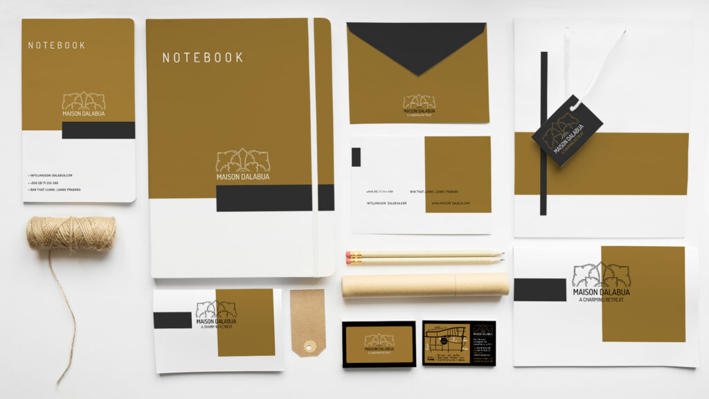
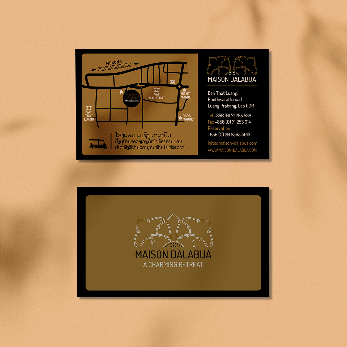
MAISON DALABUA
VISUAL IDENTITY & ADVERTISING
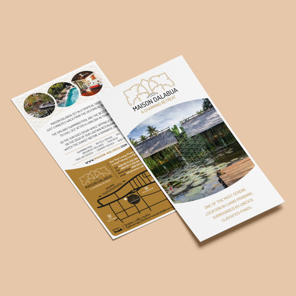
Visual identity coming from the shape of the “dok tiok” aquatic plant, a nod to the location of the hotel which is surrounded by a lush water pond.
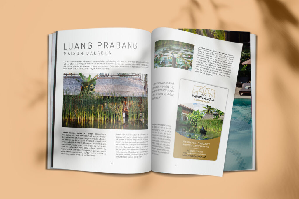
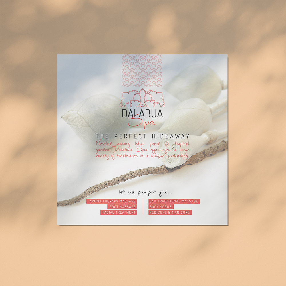
LOGOTYPE, PRINT DESIGN & ADVERTISING
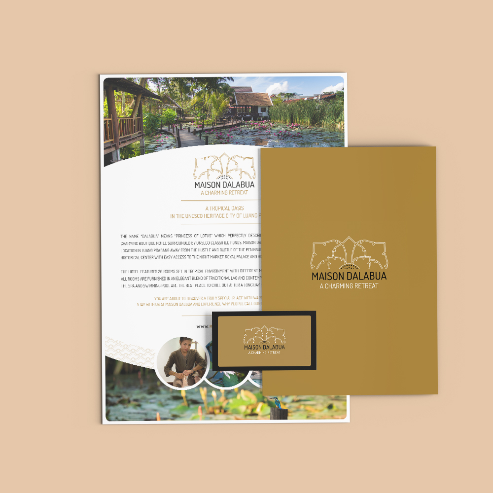
VISUAL IDENTITY & ADVERTISING
LOGOTYPE, PRINT DESIGN & ADVERTISING